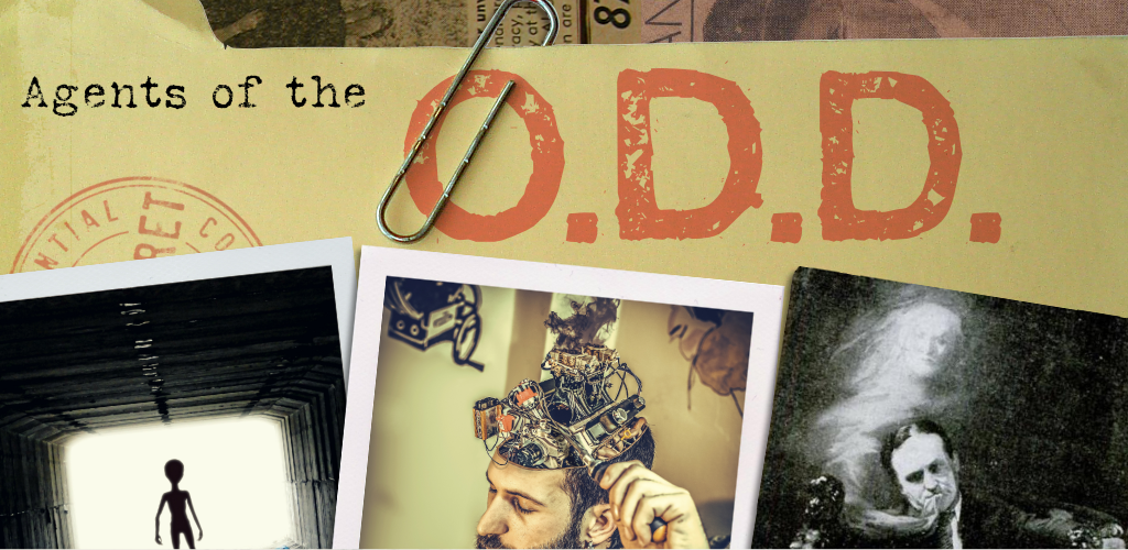
Agents of the O.D.D.
Fonts of Wisdom
Please pardon me while I take a break from obsessing over game design long enough to obsess over graphic design. Specifically, typefaces.
If one of my students had turned in a 40-page book in a novelty typeface back when I was teaching design classes, I would've docked their grade for it. I gave myself a pass for Agents of the O.D.D. because it was just too damn much fun to write the thing in a purposefully uneven and distressed font that looks like it came from a janky old typewriter. My doubts caught up with me while reading over the rules during editing, though. How much legibility is too much to sacrifice in the name of fun?

If it were just a matter of legibility, I might've been able to shake this doubt off by reassuring myself that I can also release a plain-text version that's friendlier for text-to-speech readers. No less worrisome, to me, was the fact that the metaphor of typewritten pages kind of broke down the more I looked at the document. RPG texts of a certain length need headings and contrast to make them easy to skim as reference materials; memos and letters typed on a typewriter tend to lack such features, save for the occasional bit of standardized letterhead. A faded and distressed style wouldn't necessarily be too bothersome for a short RPG, and then I might feel like I could commit more to a visual style that looks straight from a hastily photocopied government document. See, for instance, the downloadable sample for another typewriter font, FF Trixie.
I could do that. But should I? Even if I were to go with a font with a more even baseline than Silk Remington, like FF Trixie, the fading, distortion, and possibly mixed metaphors are still a lot to deal with for a document of 40 pages (and counting).
So I started experimenting with other options.

Cleaner and more typewriter fonts like American Typewriter and Prestige Elite were certainly easier to read, but kind of missed the entire point of using a typewriter font.

Conventional wisdom suggests that you ought to use a serif typeface for longer texts, so I tried a couple that looked less "fancy" and more "serious" to my eyes. Honestly, though, this just made me feel like I was reading somebody else's book. Utopia and Minion both looked good—they just didn't look like a training manual for a sketchy, eccentric, quasi-governmental agency that's trying to keep the world safe from (or at least ignorant of) aliens, monsters, and oddballs like the player characters. I wondered if I might be able to get away with a relatively readable sans serif for the whole thing.

I was using Trade Gothic in some other places (just because it looks great when you type “TOP SECRET” in condensed bold caps, even though I don’t actually do that anywhere), so I figured I’d see how it looks for the whole document. It’s okay, but I worry it’s a little too dense and not very easy to scan, with less contrast between bold and regular than I want.

Avenir Next feels very promising to me. Inspired by Futura (which would be familiar to fans of Fallout video games), its bold condensed face has a sort of claustrophobic urgency, and it just feels kind of weirdly sure of its own cleanliness and precision. I also appreciate the huge contrast between the bold and regular weights, making it way easier to skim.

I told myself when I started this game that I wasn't going to just use Helvetica again. I would use a wacky font that would be fun to type in! (Yes, I type right into my layout program when I write games. I'm a damn rebel.) But I have to admit: Helvetica Neue might be an unexpectedly good fit for this project. As Bethany Harvey assured me, "I 100% buy that this is what a shady government agency's handbooks would look like." Its impersonal genericness might actually be an asset in this particular case.
I’m pretty torn between Helvetica Neue and Avenir Next right now, but also quite open to other feedback. (I’d also dearly love an excuse to convert the whole thing to FF Trixie, but after spending $30 on one typewriter font I may never use, I should probably be more wary about spending $100 on another typewriter font I may never use.) So, graphic design enthusiasts and RPG readers of the world, please do feel welcome to share your wisdom of fonts with me.
Comments
Log in with itch.io to leave a comment.
As someone who laid out a game in typewriter font, here's my 2c.
First of all, let's look at your non-typewriter options.
Serif fonts (unless inspired by the programming fonts with its geometric forms, monoline weights and slab like serifs) will create a wrong feel to the text. It will either push the text more towards fantasy (not sci-fi) literature or everyday mundanity. I don't think it is something you would want.
Helvetica is the vanilla of the font world. It is perfectly fine, and will seldom clash with other flavors, but it will not add that much on its own. If you are going for no-nonsense, direct approach (or you are at a deadline and need something to just fit in) - go for it, but you can't really "season" the text with Helvetica and give it a theme.
You can season with Avenir. The futurist roots of the font, mixed with a bit of playfulness fit the theme of Agents of the O.D.D well. Not to mention, manuals for big organizations would often use sans serif fonts, as they were the non-nonsense new hotness when manuals became more of a thing (1960s). Sure - this is the time that Helvetica rose to power, but it became so ubiquitous that it lost its flavor. If you decide to go with non-typewriter typeface, Avenir is a good call.
...and now for typewriters.
The font you currently have is very distressed. It looks like it was made on a beaten up typewriter, with over-saturated ink ribbon or pulpy paper. It gives it a LOT of personality and creates a time and space around it. I love it... but yeah, it is not great for body text.
The big issue here is the texture. The jagged lines look cool, but they also "vibrate" on white page (especially on the screen) and make our eyes tired. You can experiment with minimizing it by mimicking how it would look made with actual typewriter or actual paper. After all, people are perfectly capable of reading (even beaten up) typewritten text without much issue. The problem here is contrast.
Unlike fonts, typewritten text like this would have a range of values. The ink bleed (what gives those letters this jagginess) would be lighter than the core of the letter and it would flow better with the page (which would not be pure white, nor would it shine light into our eyes like screen white does). The font has a very noisy change between the white and black - this jagged change makes our eyes tired. You can try to minimize this eye strain it by not using a pure black for your text (maybe something around #1a1a1a instead) and not making the page pure white. Give it a bit of yellow or just grey it our a bit. Even if you have the #1a1a1a text and an ecru page it will still read as pure black & white - but it will be much easier on the eyes.
Another idea is to create more whitespace on the page. Leave out some spots for the reader's eye to rest safely away from the noise of the font.
Of course - you can try using a different typewriter font. One that is not a crisp and perfect recreation, but also not as distressed. This is what I ended up doing for Endure. I used F25 Executive - it still has a bit of ink bleed (giving it almost a humanist like aesthetic), but it is not distressed to the point of being noisy. For me it was a good balance between machined and man-made look.
...and for keeping it looking like an artifact from the time & place - you can still keep the headers in a sans serif font and make it look like it was made few decades ago using office supplies. After all Letraset was a thing, and many offices used it :D
[it ended up being much more than 2c, but hopefully it was worth to spend the time reading this]
Okay, I'm no longer sick and it's not a holiday, so I finally have half a minute to actually respond to things! Woo!
Thanks so much for all this detailed feedback, Fred. I welcome your 2¢+ any day of the week. Looking at Endure again reminds me that following through on the analog-made metaphor actually takes quite a bit of careful work, and I'm not sure that the end product is exactly what I'm looking for. Not sure Helvetica Neue or Avenir Next is quite what I'm looking for either, of course, so I wonder if my next step might be to figure out what the overarching style might need to be – black-and-white photocopied, maybe? – and see how different typefaces work with that. Whatever the case, your post probably talked me off the ledge from just diving into using Helvetica Neue and hoping for the best. :)